Essential Question: What techniques can I use to successfully translate my sketch to a digital image using Illustrator
Today we will look at some of the sketches and discuss what’s working well and why their tattoo design is successful. We will talk about how these examples used line weight successfully and how they also balance out their work by using negative space. We will also continue to bring our sketches into Adobe Illustrator to create a digital version of our drawings.
Negative Space:
Negative space is the space around and between the object(s). Using negative space gives a piece “compositional balance”, meaning that the image feels more stable visually. Negative space can also add a focal point to your drawing and attracts your viewers’ eyes. When you create compositional balance it means that no part of the structure of your design overpowers another.
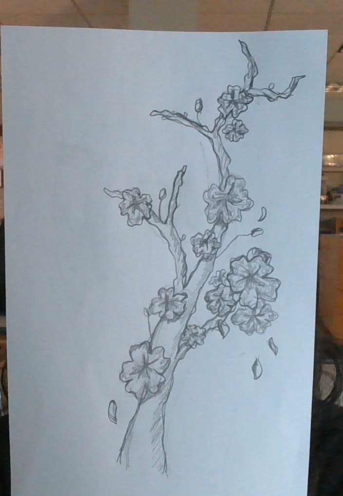
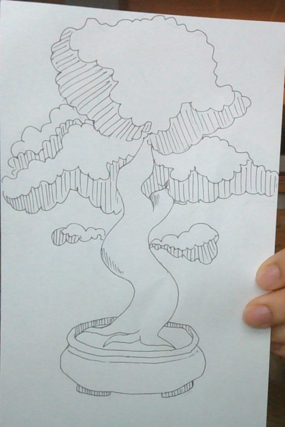
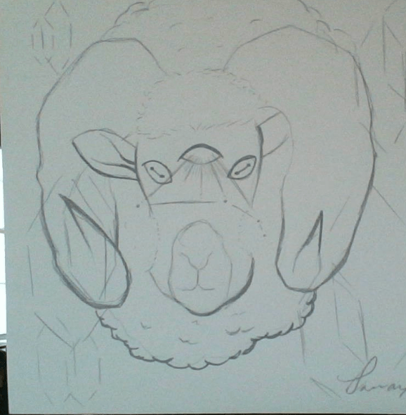
Sketch Examples:
Creating a new Illustrator file & the Pen Tool
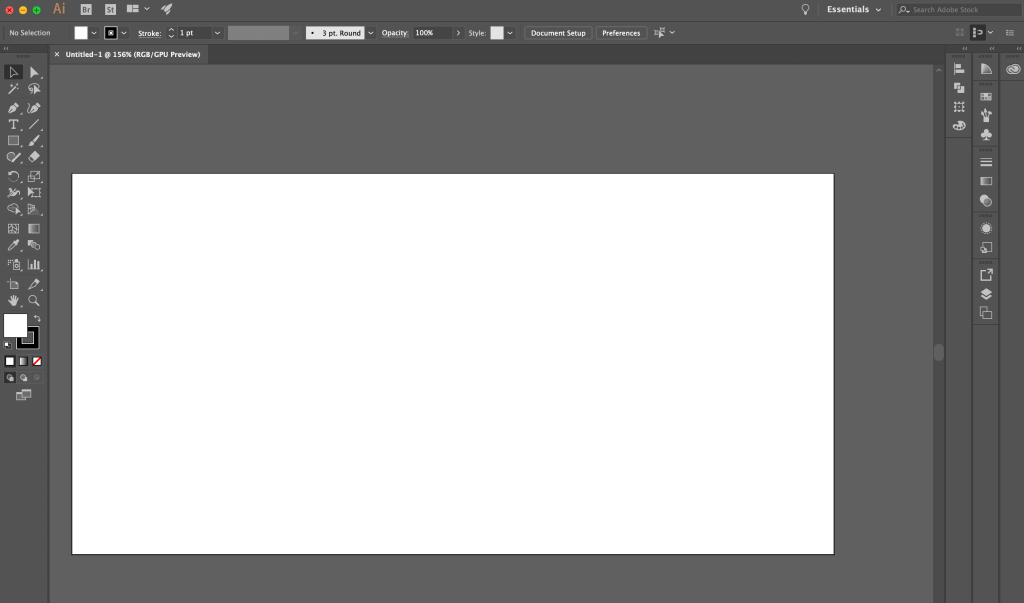
Review making a new Illustrator file:
Create new file:
Set up file type to be the correct size and orientation:

Where to find the pen tool:

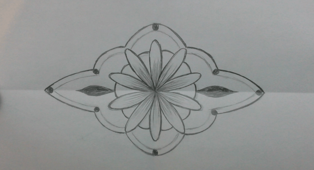
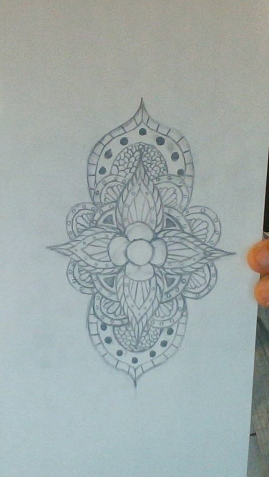
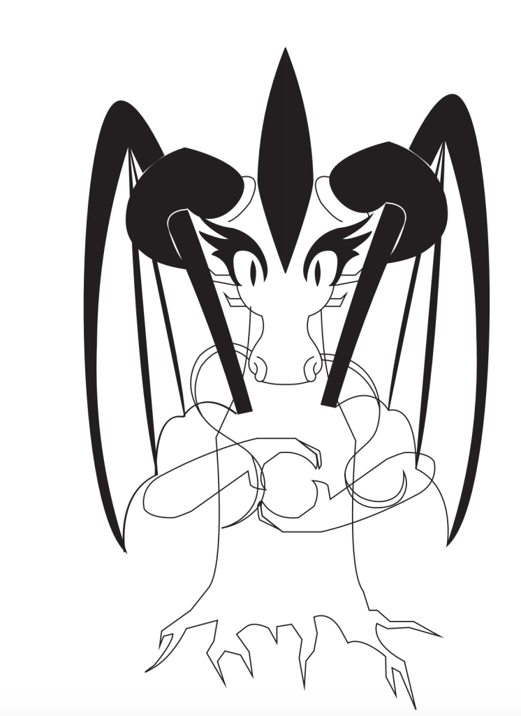
Sketch Examples:
Today We Will:
- Talk about our classmates’ sketches and why they were successful
- Discuss negative space and compositional balance
- Bring our sketches into Illustrator and continue to create a digital version.
- Write a blog post about our progress while answering the following questions:
- Describe the ideas and intentions behind the decisions you’ve made with your tattoo designs?
- What has been easy and what has been difficult?
- How will continue to improve your design in the next class?
